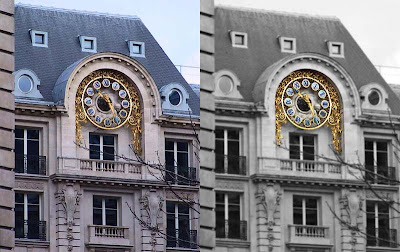
So, here goes.
 On the left is the original picture, and on the right is the photo after I messed with it in photoshop. Which do you like better?
ps to claude : I don't really remember where this building is. Looking back at the order in which I took pictures that day, it may be somewhere along the blvd. des Italiens, or on a close-by street.


I was looking forward to that, so thank you for the before and after. The colors in the after are more subdued and make the clock more striking, whereas the before makes is more "clinquant," flashy. I like the after much better. You were right to do it. Vive Photoshop!
ReplyDeleteThank you for sending me to your March 4, 2007 for the eclipse. It's beautiful! I didn't have the internet at that time. That's why I missed it. The one I saw on Exurbitude was Feb. 20, 2008.
ReplyDeleteCould you do permanent photoshop on a live subject? Erase a few lines from my face, enliven the colours? Hate the look in early morning. Can't afford cosmetic surgery...
For the clock: Definitely like the after better. The clock becomes the star.
Good pun, Les villes en rose. We enjoyed following the French elections on the internet, maybe because we're sick of the campaign in the US. But this year PA's late primary might actually mean something. I'm looking forward to voting FOR someone instead of against.
ReplyDeleteDo you have an opinion on whether the US or French electoral system is better? I'm interested!
I definitely like the second better, it brings out the clock and I think adds to the photo. Great work!
ReplyDeleteI prefer the sharper focus of the original
ReplyDeleteThanks to all for chiming in! It looks like most of you like the changed image, except for Victor, who prefers the original.
ReplyDeleteI have to say that I like the original, too, with the blue tint in the slate roof and the crisper focus. But even that shot was photoshopped a bit (cropping, color correction, etc.), so there you go.
My only goal was to learn a few more features of photoshop - I'll never be able to learn them all.
louise, I like the fact that in French elections, there is nowhere near the level of campaigning that there is in the US, and reporters don't hang with the candidates and talk about their haircuts.
claudia, if I could do that, I'd be a wealthy man!
Well, I hope it's not too late for me to sway the balance a little. I definitely prefer the real thing. I rarely touch up my photos except for a little cropping and once in a while some focus improvement on Picasa. I really like to see things as they are.
ReplyDeletebetty, glad to hear your opinion - I mostly touch up my old scanned slides because the raw scan leaves a little to be desired. Digital photos don't need much adjustment, usually just cropping.
ReplyDelete